

Custom Baseball Caps: How to Design the Perfect Hat for Your Brand or Personal Style
2026-08-14
Designing a custom baseball cap isn’t just about slapping a logo on some fabric—it’s about creating a wearable identity. Whether you’re building a brand or upgrading your personal style, the right hat turns heads and tells a story before you even say a word. At 4ugear, we’ve seen how the smallest details—from stitching to brim shape—can make or break the final look. In this guide, you’ll learn exactly how to design the perfect hat that fits your vision, your audience, and your everyday vibe. Ready to turn your idea into a cap people actually want to wear? Let’s dive in.
Low Crown or High? Get the Silhouette Right First
The crown height sets the entire mood of a hat before you even notice the brim. A low crown sits close to the head, giving off a relaxed, almost effortless vibe that pairs well with casual coats and weekend denim. It never fights for attention, which makes it a safe choice when you want the rest of your outfit to do the talking.
Go higher and the silhouette changes completely. A taller crown adds vertical presence, sharpening your profile and lending a bit of old-school formality. This works especially well if you have a rounder face, as the extra height can balance out softer features. Just keep the brim moderate so the whole look doesn't tip into costume territory.
The real trick is matching the crown to your build, not just your style. Slim frames can carry off a high crown without looking top-heavy, while broader shoulders often suit a low or medium profile. Try on both with your everyday jacket and check a side mirror: the hat should feel like an extension of your posture, not a separate decision.
Cotton Twill Is Fine, But Have You Tried Waxed Canvas?
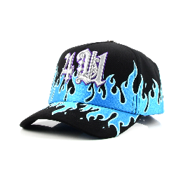
Cotton twill has long been the dependable workhorse of casual jackets and chore coats. It's soft, breathable, and breaks in nicely after a few washes. But if you've ever been caught in a sudden downpour and felt that damp chill seep through the fabric, you know its biggest weakness: cotton twill drinks water like a sponge. That's where waxed canvas steps in, carrying the same rugged heritage but with a serious upgrade in weather resistance. The wax treatment transforms ordinary cotton into a shield against wind and rain, while still allowing the fabric to develop a rich patina over time—something synthetic technical shells will never give you.
What makes waxed canvas truly special is how it ages. Unlike twill, which fades and softens uniformly, waxed canvas creases and folds into a unique map of your daily wear. The wax gradually wears off at high-friction points—elbows, cuffs, pocket edges—creating lighter, softer zones that contrast beautifully with the darker, wax-rich areas. It's a fabric that tells a story, and no two jackets end up looking the same. That kind of individuality is rare in an era of mass-produced outerwear.
Of course, waxed canvas demands a bit more care: it's not machine-washable, and you'll need to re-wax it every year or so to keep the water resistance sharp. But for many, that's part of the appeal—a small ritual that connects you to your gear in a way that throwaway fashion never could. If you've only ever worn cotton twill, a waxed canvas jacket might just change how you think about your everyday layer.
Matching Your Logo Color Exactly Is Harder Than You Think
Most people assume their logo has one true color, but that idea falls apart the moment you look at it on different screens, under different lighting, or printed on different materials. The same hex code can appear vibrant on a phone and dull on a desktop monitor, while the printed version might shift toward green or purple depending on the paper’s brightness and the printer’s ink limits.
Brand guidelines often list Pantone, CMYK, RGB, and hex values as if they are interchangeable, but they are not. Converting between them forces compromises, especially with bright blues, oranges, and greens that sit outside the printable color range. Even two printers using the same file can produce noticeably different results because of calibration, ink age, or ambient humidity.
If you need your logo color matched on a physical product—say, a sign, a t-shirt, or a product label—chasing an exact match becomes a process of visual approximation rather than a simple copy-paste. That is why experienced designers ask for a physical sample or a defined tolerance range instead of promising pixel-perfect consistency across every medium.
3D Puff Embroidery Looks Great—Until It Doesn't
There's no denying the impact of raised, dimensional lettering on a cap or hoodie. The foam underlay gives each stitch a rounded, almost inflatable quality that catches light and demands a second glance. But that same thickness can betray you the moment the embroidery faces real-world wear. A heavy scrape against a wall or a rough cycle in the wash can flatten sections, leaving you with a lopsided, half-puffed logo that looks more accidental than intentional.
The real trouble starts when the foam doesn't fully dissolve or when the stitch density is slightly off. Too few stitches and the puff collapses into a wrinkled mess; too many and the thread cuts through the foam entirely, creating a hard, crusty ridge that feels like plastic. You'll also notice that fine details—thin serifs, tiny gaps, sharp corners—tend to blur or fill in completely. What was crisp on a flat mockup turns into a mushy blob on fabric, especially after a few wears.
Even the best-digitized puff design has a shelf life. Repeated flexing of the fabric works the foam remnants loose from the thread, and soon you'll see tiny white specks peeking out between stitches. Colorfastness can also suffer because the raised surface rubs against everything. So while that 3D look is undeniably eye-catching on day one, it often degrades into a fuzzy, uneven shadow of itself long before the garment itself wears out.
The Undervisor Is Wasted Space Unless You Design It
Most caps ship with a plain undervisor because it is treated as a structural afterthought. That flat strip under the brim catches shadow, not attention. Flip that logic: a printed pattern, a saturated color block, or even a single line of type immediately changes how the hat reads from below and from the side. It gives the brim a second face instead of leaving it as dead fabric.
Glare reduction still matters, so choose materials and tones that work with the setting. A matte black undervisor keeps reflections low and pairs easily with brighter crown colors. A deep green or burgundy adds depth without turning into a distraction. If the goal is to be noticed, go the other way and use reflective thread or a high-contrast repeat that only appears at certain angles.
The undervisor can also carry details that do not belong on the front. Put the release year, a short phrase, or a coordinate pair there. People tend to tilt a cap when they talk about it, so that hidden mark becomes part of the story. It is a small surface, but it is the one space on a hat that gets discovered rather than announced.
A Leather Strap Closure Instantly Upgrades the Whole Hat
There's a quiet confidence in the way a leather strap closure sits against the back of a cap. It replaces the usual plastic snap or fabric buckle with something that feels considered—like the hat was finished by hand rather than stamped out. The strap ages over time, picking up a patina that matches the wear on the brim, so the whole piece starts to tell a story.
Beyond looks, the leather strap adds a functional upgrade that's easy to miss at first. It holds its adjustment more securely than a standard snap, and the extra width distributes pressure evenly across the back of your head. That means no pinching, no slipping, and a fit that stays comfortable from morning coffee to late afternoon errands.
It's a small detail, but it shifts the entire feel of the hat. What might have been a basic cap becomes something you reach for more often, simply because that leather touch makes it feel less disposable and more like a piece you'll keep for years.
FAQ
Start with the crown style. A structured, high-profile crown gives a sporty, classic look, while unstructured and low-profile shapes feel more relaxed and modern. This single choice shapes how the whole hat sits on the head, so it's worth trying on a few blanks before you commit.
Cotton twill is the safe, breathable default, but don't overlook brushed canvas or wool blends if you want texture. For hot climates, a poly mesh back keeps things cool, and a sweat-wicking inner band does more for comfort than most people expect.
Front and center is the obvious spot, but think about scale: a small emblem on the front panel can look sharper than a huge print. Embroidery on the side or a small mark above the back closure adds a subtle branded feel without shouting.
Try pairing a muted base like charcoal, olive, or dusty blue with an accent color on the undervisor or top button. Two-tone panels with a contrast eyelet color often read as intentional design choices, not just color blocking.
Yes—upgrade the sweatband to a soft cotton or leather-like material, choose a metal or matte buckle instead of plastic, and match the thread color on the brim stitching. These small changes show up clearly in person and in photos.
Three is a sweet spot for a first run: one dominant base, one contrast panel or brim color, and one thread or accent color for embroidery. More than four often muddies the design unless you already have a strong brand palette.
They forget to check the inside label area. Working with a blank that has a removable neck label or minimal branding on the inside gives a cleaner finish, especially if you plan to add your own woven label later.
Conclusion
Getting the crown height right sets the tone before anyone notices the logo. A low crown reads sleek and modern, while a high crown leans more classic and structured—neither is wrong, but they speak to different audiences. Fabric choice quietly does the same work. Cotton twill is the safe default, but waxed canvas adds a rugged texture that breaks away from the sea of identical caps. Once you settle on materials, prepare for the logo color headache: thread options rarely match your brand's exact Pantone, so you'll need to compare physical samples under daylight and accept a close-but-not-perfect match or adjust the logo itself.
Embroidery technique matters more than most people expect. 3D puff looks bold on large, simple shapes but turns messy on small text or fine details, so reserve it for oversized initials or basic icons. Don't leave the undervisor blank—that strip of fabric is visible when the hat tilts up or sits on a table, making it prime real estate for a hidden message, pattern, or contrast color. Finally, swap the standard plastic snapback for a leather strap closure. It's a small change that instantly makes the hat feel more expensive and intentional, which is exactly what you want whether you're building a brand or just building your own rotation.
Contact Us
Contact Person: Tommy
Email: [email protected]
Tel/WhatsApp: 8613546956008
Website: https://www.4ugearsupply.com/